The Program of Studies at Morristown High School is a large phamplet of the courses and eductional oppertunities avalible at the school which is edited and revised every year to meet the ever-changing cirriculium and standards in the school. With that, every year a new cover is introduced for the Program of Studies containg prominant information surrounding that paticular year, such as photos of students currently attending the school. This year, I was lucky enough to be tasked with creating the cover for the upcoming 2017-2018 school year in class. The cover was expected to contain a photo collage of students at Morristown and a neat, organized title layout.
PRELIMINARY PLANNING
|
To plan out my project, I sketched out four different designs of what I hoped to achieve in making the Program of Studies. I wanted to incorporate elements that highlighted the diversity of Morristown High School and illustrated the the large variation of classes and programs offered at the school. Additionally, I wanted to include a typography layout that was equally interesting and stood out to scream 'Go Colonials!' As a result of my thumbnail sketches, I ended up combining elements from each idea that ultimately contributed to my final product.
|

Preliminary Planning Thumbnail Sketches
|

First Draft of the Program of Studies Project
|
FIRST DRAFTI attempted to base my first draft off of one of my thumbnails, which is the upper right sketch of my preliminary layout. The first thing I did with my project was make a simple layout of lines in Adobe Illustrator which was completed with the pen tool. Next, I took it into Adobe Photoshop and incorporated photos of Morristown High School students into the triangles that I made earlier. To make it more interesting, I masked a photo of two students and put it on top of the other photos just so it looked more composed. As for the text, I tried to make the words 'Program of Studies' pop off the page, however experienced difficulty when I realized I couldn't change the layout of the project as liberally as I had previously hoped. When I had completed the project, I was not satisfied with my work and decided the best alternative was to start over, which was no problem considering the first draft took little of my time.
|
PEER CRITIQUES |
FINAL PRODUCT |
|
For my classmates and I to improve our work, we handed in our project at the time to critique one another. The critiques I received were as followed.
CRITIQUE ONE - I like the effect on the Program of Studies - Very clean - Photos don't flow with titles CRITIQUE TWO - Different font is cool - Make the shape of the collage more interesting and bright, don't use black and white photos - Nice picture choice CRITIQUE THREE - This kids head is dope!! Maybe you could recreate this effect with several more people popping out of the collage - The black and white effect gets confusing... there is no pattern between black and white and colored photos - I think the photos could be laid out differently, use spacing, boarders, and cropping interestingly to make the bottom half of the page more interesting - I like the font a lot - Maybe you could recreate the geometric shapes from the font for the photos somehow? CRITIQUE FOUR - I like the effect that that you created on the front with the boys head, although maybe shrink it a bit? It seems to overbear the rest of the photos - Another thing is the black and white photos. I would use the colored photos. I would choose one or the other. Not both because it has not pattern. CHANGES I MADE One of the most repetitive critiques I received was about the fact that there was no correlation between the black and white and colored photos. However, it was my intention to make it appear that way, because it made the photos that were in color pop more, which added an interesting effect to the overall layout. Another change I made was to change the size of the masked image, which as suggested, made a big difference in the layout of the project. |
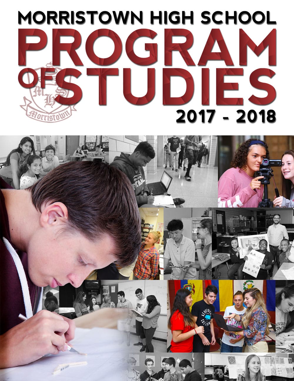
Final Product for the Program of Studies Cover
I was very pleased with my final product, especially in comparison to my first draft. I think that my idea to make the 'Program of Studies' pop was the best idea I had for this project, because I like it, and from what I can tell from the critiques, my classmates did as well. I'm satisfied with the collage as well, I wish I did something different with the photos, like as suggested in the critiques, maybe do a triangular pattern to match the title. I think I used my time wisely and approached the project in a successful manner as well, and I hope to complete projects similar to this in the future.
|
